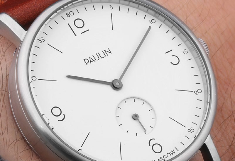
Paulin has revealed its own typeface today, designed by its in-house typographer and featuring on its latest range of watches.
The bespoke font, which will feature on the brand’s newest range Commuter Numerical, was developed in-house as a numerical only font.
The numeric designs were created by its typographer before being expanded into a full alphanumeric font. The design for the numbers was inspired by the geometric, art deco feel of their logo, and uses a system of perfect circles, straight lines, gaps, and 45 degree angles.
The design also references the size the numbers are intended to be used at; when they’re scaled down to fit on a watch dial the eye automatically fills in the gaps.
Commuter Numerical, like the first model using the bespoke numerals the original Commuter, has a simple dial, with the numbers which the brand hopes will set it apart from the other minimal watches on the market.
The Commuter range was designed to be worn every day and is manufactured from 316L grade stainless steel, PVD coated and finely brushed to give a satin finish, making it more resilient to scuffs than polished alternatives.
The glass is flat and sapphire coated, which is tough and highly scratch-resistant. As well as the classic white face and silver case combo, the range has expanded to include three new colour-ways: matte sandblasted silver; a black dial with yellow indexes; and rose gold and white.
Paulin has redesigned the buckle, the double bar acts as the first keeper, simplifying the look of the strap.
Pricing starts at £180 for the bridle leather or suede straps and increases to £205 for shell cordovan and £225 for stingray.

